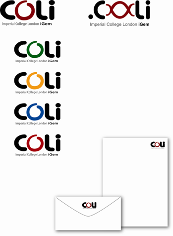
IGEM:IMPERIAL/2006/Logo: Difference between revisions
| Line 2: | Line 2: | ||
Personally don't think it's nicer than before though because it is not so compact... open to suggestion | Personally don't think it's nicer than before though because it is not so compact... open to suggestion | ||
*Should highlight "Imperial COllege London Igem"(all the capital letters should be in different colours from the other letters) | *Should highlight "Imperial COllege London Igem"(all the capital letters should be in different colours from the other letters) | ||
'''[[User:Cys| | '''[[User:Cys|Christin]] 18:05, 7 September 2006 (EDT)''': Hope these comments come still in time.... | ||
*I think we should also include the year - Imperial College London Igem 2006 | *I think we should also include the year - Imperial College London Igem 2006 | ||
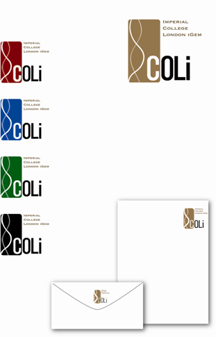
*For the blue and yellow one (I think the yellow writing and blue DNA is much nicer than vice versa) - could we get a lighter blue for the DNA? For example that light blue of the blue-coloured logo suggestion. | *For the blue and yellow one (I think the yellow writing and blue DNA is much nicer than vice versa) - could we get a lighter blue for the DNA? For example that light blue of the blue-coloured logo suggestion. | ||
Revision as of 15:10, 7 September 2006
New Draft
Personally don't think it's nicer than before though because it is not so compact... open to suggestion
- Should highlight "Imperial COllege London Igem"(all the capital letters should be in different colours from the other letters)
Christin 18:05, 7 September 2006 (EDT): Hope these comments come still in time....
- I think we should also include the year - Imperial College London Igem 2006
- For the blue and yellow one (I think the yellow writing and blue DNA is much nicer than vice versa) - could we get a lighter blue for the DNA? For example that light blue of the blue-coloured logo suggestion.
- Version 1
- Version 2
- Johnsy 09:57, 7 September 2006 (EDT): I personally like the blue and yellow one....
Tom Draft
Hi guys, did a little photoshopping on the logo to show off some ideas of how I think it should look
Idea 1
Same as Jimmy's friend's one really, except the DNA has been rotated and englarged to make the I look better.
Idea 2
I didn't think the DNA was easily distinguisahble as DNA on idea 1, so extended it out of the box. I think this one looks really nice (well, if my photoshop skills could clear up the rubbish) with the box highlighting the I as an I. The C would have to change colour though as its not in the box anymore
What do you think?
- Da104 05:14, 31 August 2006 (EDT) I like it!! I'm with Christin in saying little "O", "C" the same colour as "oLi" and please please please let's get rid of the awful brown!!! (ask Jonny for colours!!!)
Second Draft
Christin: Good job! I really like the new design.
- Some suggestions for amendments:
- Small 'o' in I.CoLi
- Shifting the I a bit downwards and making the contrast a bit more obvious
- iGEM in a new line and add 2006 to it
- Colours: dark red, red/orange, periwinkle/blue
- Perhaps a shade of the colour within the rectangle with the upper part being more intense, the lower part being lighter ?! (or vice versa)
Johnsy: It might be nicer to move the Imperial College iGEM part closer to the I.Coli part. They seem very far apart. Also, the first I needs to be darker, since you have a light background for the DNA. Overall, quite a nice design though
Tom: Yeah, I agree with Christin's comments. Not sure about the idea of shading though.
- I think the DNA needs to be tilted clockwise more, so we can get a straigher I. If that means some kind of overlap of DNA with the C of Coli then so be it.
- It might mean having to crop the top of the brown box down a bit, and moving the 'Imperial college..' thing below the logo.
- And I also think the I should be bigger, should be the biggest letter!


